Under the Cover
Before I became a parent, I’d sometimes wonder what my future children would look like. I’d patch together a combination of old baby photos, a few elements borrowed from my husband, fleshing out the rest with generic Gerber baby features. The first time I saw my son, I took one look and thought, “Oh yeah. Of course!” His face, with its morose eyes and near-invisible ginger eyebrows, neatly obliterated all those early counterfeit versions.
I’ve heard the same from other people. It’s impossible to imagine how your kid will look until you see him or her, and then it’s just obvious. How else could they look?
When I was a teenager, I’d prowl the library or bookstore shelves, plucking up whichever cover caught my attention. I’d read the jacket copy, of course, but the visuals reeled me in first. I still get attached to book covers. If I see a novel I’ve read in a different version — a paperback, maybe — I feel weirdly betrayed for a second, like a little kid whose parent has just gotten a haircut. The book is technically the same and yet it’s not quite right (until I come to love that version too).
From the first sentence I wrote of The Possessions, I was visualizing cover art. This takes a level of hubris slightly below casting the movie adaptation. In a way, it was helpful. Playing with imaginary cover art helped me clarify the atmosphere and the focus.
An unknown first-time novelist usually doesn’t have much say in a thing like jacket design. Ultimately, cover art needs to introduce the book to readers, and if the author’s vision hampers that goal, the marketing department and the design team have the last word. I entered this process knowing that I’d need to set aside my own private vision for a collaborative one, so I coached myself on how to gracefully handle disappointment.

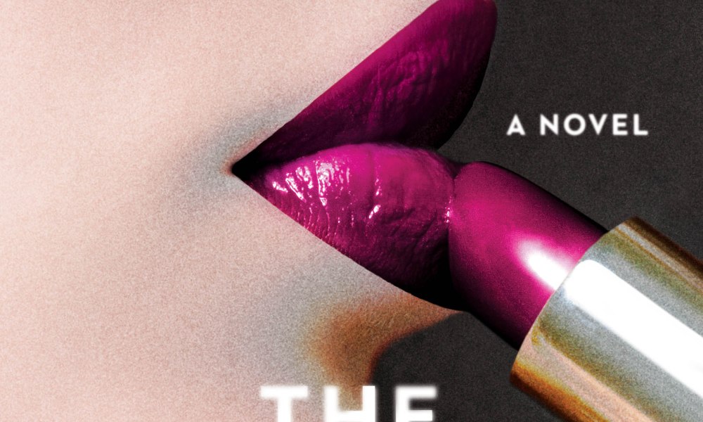
But here’s the real Cinderella spin on the story, the corny part. I fell in love with the design right away. Of two options, this one captured exactly what I wanted for The Possessions. It’s a little sensual but a little dark. A little classic but a little uncanny. The contrast between the hyper-realistic pop of the lipstick and the dreamier, softer quality of the woman’s face, like a detail from a painting, plays with the uncertainty of identity that’s at the core of the story. The novel opens with that unusual shade of lipstick, and I love that it’s featured so beautifully on the jacket. Even the fact that it looks as if someone off-screen might be applying the lipstick is a nod to the narrative.
Having a cover attached to The Possessions makes everything that much more real. Here it is: my book jacket. My name on the cover. A certain tone set, a certain story conveyed, with a single glance. It feels a lot like meeting someone I’ve known a long time already.

It always amazes me how much is involved in any creative venture. Books, movies, houses, parks, art, etc. all seem so easy when the end product flows. I am excited to see the “behind the scenes” work involved in any creation. Thanks for sharing this experience with us.
LikeLike
Of course, thank you for reading about it! It’s great to be able to share a little bit about the process of publishing the book.
LikeLike
I am so unbelievably excited for this! I am going to buy this the second that it’s out (or pre-order? Can I pre-order?) and suggest is as my book club read! Also, this cover is perfect. PERFECT. I’d pick this up in a bookstore, 100%.
LikeLike
I have heard rumors that you can pre-order already!
Thank you so much for your lovely enthusiasm. I’d be beyond honored for your book club to read my novel.
LikeLike
It looks so amazing. I would definitely see that cover and explore the book if I came across it in a library or bookstore.
LikeLike
That’s so good to hear!
LikeLike